Let's take a look at ways to compare statistical data by examining their graphs.
Remember:
When comparing graphs of data, you should consider the Shape, any possible Outliers, the Center, and the Spread of each distribution.
"Remember to look at each graph's SOCS!" |
|
|
TASK: Prepare box plots and compare the following test scores:
Kyle's Scores: 85, 76, 92, 88, 75, 90, 80, 88
Amira's Scores:
91, 84, 86, 76, 71, 82, 80, 90 |
• Prepare a box plot for each student
This can be done by hand or with a graphing calculator.
• A few of the possible findings:
(S)(S) Both graphs are slightly skewed left, with the data on the left of the medians being more spread out. The data to the right of the medians are closer together.
(O) There are no outliers in either plot, which says neither student really "bombed" a test.
(C) Kyle's median score is higher than Amira's median score (86.5 vs 83).
(S) The range of Kyle's scores is 92-75=17 and the range of Amira's scores is 91-71=20. Kyle's scores are slightly more consistent.
(other observations) |
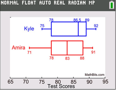 |
• Kyle's lowest (75) and highest (92) scores are both better (higher) than Amira's scores (71 and 91).
• 50% of Kyle's scores are above 86.5, whereas 50% of Amira's scores are above 83.
• Conclusion:
You can conclude that Kyle's scores are slightly better than Amira's scores. |

TASK: Sven is preparing for a 15 mile Snowshoe Marathon.
Prepare a histogram and a box plot and compare what is being shown.
Miles covered during each practice run:
2, 2, 3, 4, 5, 5, 6, 6, 7, 5, 8, 9, 2, 10, 11, 4, 12, 2, 13, 4, 15, 5, 11, |
• Prepare a histogram and box plot
This can be done by hand or with a graphing calculator.
• A few of the possible findings:
The histogram:
• (S) shows peaks in the data, telling the number of times Sven repeated the runs in each interval (not seen in the box plot).
• gives a clearer picture of the number of miles spent in each practice run interval (not seen in box plot).
The box plot:
• (C) clearly shows the median (middle) of the data (more calculation would be needed to determine this value from the histogram). |
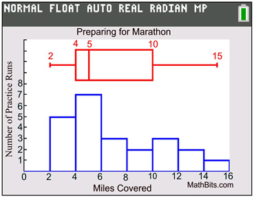 |
• (S) shows that 50% of the lengths of the runs falls between 4 miles and 10 miles (more calculation needed to obtain this information from the histogram).
Both graphs:
• (S) show that the data is skewed to the right, indicating that most of the practice runs fell far short of the 15 miles needed for the marathon.
• (O) neither graph shows the presence of outliers.
• Conclusion:
You can conclude that the majority of Sven's practice runs are far less than the actual 15 miles he will need to traverse for the upcoming marathon. Perhaps these are his "beginning" practice runs, with more extended practice runs to follow. If not, it would appear that Sven is not ready for the marathon. |

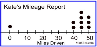
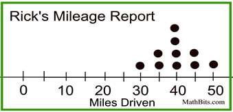
TASK: Kate and Rick submit mileage reports every two weeks as seen by the graphs of their reports.
Compare what is being shown.
|
|
|
|
• Some findings from Kate's Report:
• (S) the graph is skewed to the left due to the outlier.
|
|
• Some findings from Rick's Report:
• (S) the graph is symmetric (a mirror image of itself centered on 40).
|
• (O) the 0 mileage is an outlier.
The interquartile range is 10, and 0 is
less than the first quartile (40) minus 1.5 x IQR (0 < 25). |
|
• (O) the data is clustered around 40 and there are no outliers. |
• (C) The median is 45. The mode is 45.
The mean is 41 (the value of the mean is being pulled to the left by the outlier). |
|
• (C) The median is 40. The mode is 40.
The mean is 40. The measures are all the same due to the symmetry of the graph. |
• (S) The range is 50.
The interquartile range is 10.
The population standard deviation is 14.11. Kate's standard deviation is larger because her data spread is larger due to the outlier. |
|
• (S) The range is 20.
The interquartile range is 10.
The population standard deviation is 5.48.
|
Conclusion:
Their employer notices that Kate averaged 41 miles per day, and Rick averaged 40 miles per day, concluding their efficiency to be similar. We know that the outlier is affecting Kate's report. What we do not know is whether Kate's report minus the outlier would be typical of her daily mileage, making her average daily mileage 45.6, or whether she increased her mileage over 9 days since she had no mileage for one day. We also do not know if more mileage is viewed favorably by their employer. |
|