|
|
A scatter plot is a graph of plotted points that shows a relationship between two sets of data. Scatter plots are composed of "dots" (points) on a coordinate axes. |
| The data in a scatter plot is quantitative data (meaning it consists of numbers),
and is referred to as bivariate data (meaning it works with "two" sets of data). |
In this section, we are going to examine "line of best fit".
The line of best fit is a straight line that represents
the pattern, or trend, of the data. |
The line of best fit seldom hits every dot on a scatter plot.
While we should try to have the same number of dots above our line as below our line,
that arrangement may not always be possible.
The line of best fit usually runs through the "center" of clustered data
so that it is in a position that is as close as possible to all of the dots.
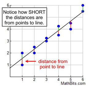
The line minimizes the distance between itself and the plotted data.
The closer the line can be positioned to allow the shortest distances to clustering points,
the better the fit of the line.
This is a very good line of best fit.
It is very close to all of the data plots.
 |
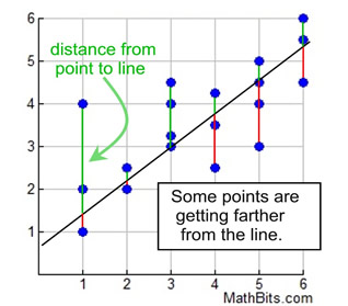
This line of best fit is not as strong.
Some points are quite far from the line.
 |
At this level, we will be making observations regarding the line of best fit,
and estimating lines of best fit by selecting two points in the data set.

Determine an equation for the line of best fit. |
Follow the link below for directions
on how to determine an equation for the line of best fit
(1) using paper and pencil, and (2) using a graphing calculator.
1. Using Paper and Pencil (preferred method at this level)
This method will be your best guess for the equation
based upon your choice of which two data points to use.
2. Using a Graphing Calculator (optional method)
This method will yield the "best" choice for the line of best fit since the calculator takes into consideration the distances from the line to the data points. |

Using the Line of Best Fit Equation to Predict Results |
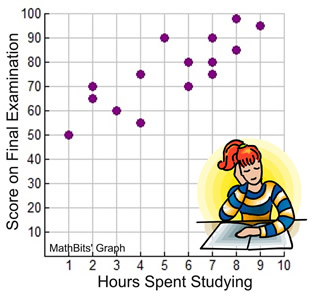
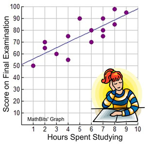
We examined the relationship between "Hours Spent Studying" and "Scores on a Final Examination" in the Introduction to Scatter Plots. Let's revisit that example to see how to find and use the equation for a line of best fit.
What is the equation for the line of best fit for our "studying affects scoring" problem? |
When finding the line of best fit equation "by hand" using two chosen points, different students may arrive at different answers depending upon the points used. So who's answer is the best?
Actually, all of their answers are "correct" when using this method.
But to find the "best" answer, you will need to use a graphing calculator.
|
|
Find the Equation for the Line of Best Fit |
Using Paper and Pencil Method
( The preferred method.)
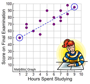
1. Determine two data points that will create your line of best fit. Try to fit your line to have approximately the same number of dots above as below the line.
We are choosing the points (1,50) and (9,95).
This gives us 7 dots above the line and 6 points below the line.

2. Calculate the slope using the two points.

3. Write the equation of the line using y = mx + b.
y = 5.625x + b
To find "b", replace x and y with one of the points, such as (1,50), where x = 1 and y = 50.
y = 5.625x + b
50 = 5.625(1) + b
b = 44.735
The equation is: y = 5.625x + 44.735 |
Graphing Calculator Results
( Listed only for comparison.)

The graphing calculator computed the line of best fit with the equation:
y = 4.609662577x + 51.78911043
Directions for using the calculator to determine the equation for the line of best fit. |
Based upon our "paper and pencil" equation, we can now
predict scores given any number of hours spent studying.
|
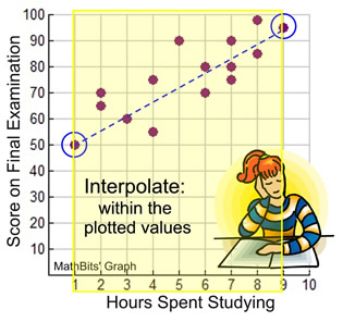
If you are making predictions for values that fall within the plotted values, you are said to be interpolating. For this problem, our plotted values range from x = 1 to x = 9.
Example: Predict the final examination score of a student studying for 5½ hours.
(Substitute the number of hours into the equation for x.)
y = 5.625x + 44.735
y = 5.625(5.5) + 44.735
y = 30.9375 + 44.735
y = 75.6725
Score: approximately 76
(FYI: calculator score = 77) |
 |
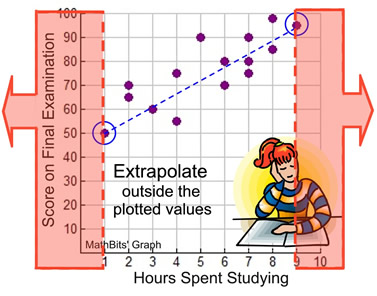
If you are making predictions for values that fall outside the plotted values, you are said to be extrapolating. Be careful when extrapolating. The further away from the plotted values you go, the less reliable is your prediction. For this problem, outside of the plotted values would be x greater than 9 or x less than 1.
Example: Predict the final examination score of a student studying for 12 hours.
(Substitute the number of hours into the equation for x.)
y = 5.625x + 44.735
y = 5.625(12) + 44.735
y = 67.5 + 44.735
y = 112.235
Score: approximately 112
(FYI: calculator score = 107) |
|
WOW!!! Great score of 112 on the Final Exam!!
 But is it realistic? It is very likely that the top score is 100. But is it realistic? It is very likely that the top score is 100.
So, in addition to yielding less reliable predictions, extrapolating
may also give completely unrealistic predictions.
(Note: even the calculator score of 107 is unrealistic.)

NOTE: The re-posting of materials (in part or whole) from this site to the Internet
is copyright violation
and is not considered "fair use" for educators. Please read the "Terms of Use". |
|

