|
Bar graphs and histograms are used to compare the sizes of different group/categories.
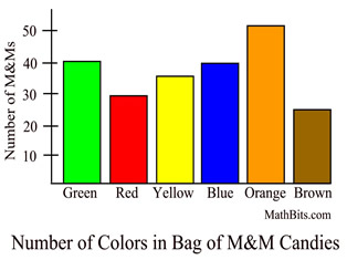
Bar Graph (Chart)

General Characteristics:
• Column label is categorical variable (colors).
•
Column height is size of the group.
• Columns separated by space.
• Since this data is categorical, the only possible calculation is finding the mode. |
|
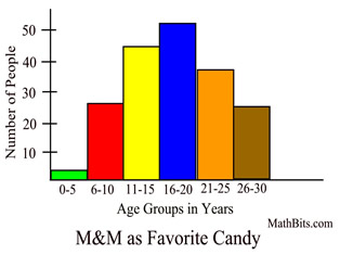
Frequency Histogram

General Characteristics:
• Column label is quantitative variable (ages).
• Column label is a range of values (or single value).
•
Column height is size of the group.
• Columns NOT separated by space.
• Calculate mean, median, quartiles, and so on.
|
|
Note: The overall shape of a histogram will vary when the width of the intervals (also referred to as "bins") is changed. It is important when working with your graphing calculator to be aware of the width size of your intervals, and how to control them. See the link at the bottom of this page for help with graphing histograms on your graphing calculator.
 Histograms versus Bar Graphs: Histograms versus Bar Graphs: |
Generally speaking ...
1. Histograms are used to show distributions of variables, while bar graphs are used to compare variables.
2. Histograms plot quantitative (numerical) data with ranges of the data grouped into intervals, while bar graphs plot categorical data.
3. The bars in a bar graph can be rearranged, but it does not make sense to rearrange the bars in a histogram.
4. It is possible to speak of the skewness of a histogram, but not of a bar graph.
("Skew" means a graph tends to have a long tail on one side (either left or right).)
5. Bar graphs have space between the columns, while histograms do not. |

 Frequency Histograms: Frequency Histograms: |
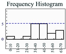
Histograms are generally constructed from frequency tables, thus the name "frequency histogram." The intervals from the table generally appear on the x-axis and the frequency values appear on the y-axis. The frequencies are represented by the height of each column
located directly over the corresponding interval. There is no space between the columns. If an interval's count is zero, however, a space (or gap) will appear since the column has a height of zero.
Data set: {9, 25, 30, 31, 34, 36, 37, 42, 45, 47, 49, 43, 55, 58, 61, 63, 67}
Frequency Table |
Interval |
Count (frequency) |
0-10 |
1 |
11-20 |
0 |
21-30 |
1 |
31-40 |
5 |
41-50 |
5 |
51-60 |
2 |
61-70 |
3 |
|
 The intervals appear on the horizontal axis. The count (frequency) appears on the vertical axis.
 |
Scaling a Histogram:
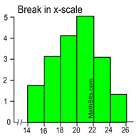
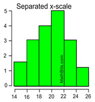
When graphing histograms, if the first
x-scale interval does not start at zero, a "break" symbol may be drawn to show a gap in the scale.
Or a histogram may display a separated x-scale to avoid confusion with the vertical axis.
|
|
|
|
 Histograms:
Pros and Cons |
PRO: A histogram emphasizes the distribution of values. Histograms clearly show the shape of the data. In addition, values occurring with high frequency are easier to identify in a histogram than in a box plot.
CON: With histograms, however, the center and spread are harder to identify, exact values cannot be read due to the grouping of the data, and it is difficult to compare two data set. |
|

Other types of histograms you may encounter:
 Cumulative Frequency Histograms: Cumulative Frequency Histograms: |
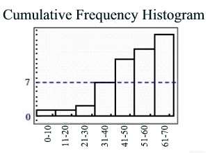
The term "cumulative frequency" refers to the running total of the frequencies. Each interval now contains a frequency number which represents that specific interval's count added to the sum of all the previous intervals' counts. A cumulative frequency histogram will always contain column bars that get increasingly taller (or stay the same height) as you move to the right.
Data set: {9, 25, 30, 31, 34, 36, 37, 42, 45, 47, 49, 43, 55, 58, 61, 63, 67}
Cumulative Frequency Table |
Interval |
Count (frequency) |
Cumulative
frequency |
0-10 |
1 |
1 |
11-20 |
0 |
1 + 0 = 1 |
21-30 |
1 |
1 + 1 = 2 |
31-40 |
5 |
2 + 5 = 7 |
41-50 |
5 |
7 + 5 = 12 |
51-60 |
2 |
12 + 2 = 14 |
61-70 |
3 |
14 + 3 = 17 |
|

Notice that the columns increase in height, or stay the same,
as you move to the right. |
 Relative Frequency Histograms: Relative Frequency Histograms: |
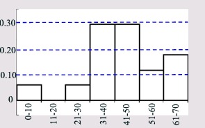
While the term "frequency" refers to the number of observations (or counts) of a given piece of data, the term "relative frequency" refers to the number of observations (or counts) expressed as a "part of the whole" or percentage. Each of the number of observations is divided by the total number of observations from the entire data set. In the data set we have been examining, there are 2 pieces of data in the interval "51-60", but there are 17 total pieces of data. The relative frequency of the 2 pieces of data in the interval "51-60" is 2/17 or 0.12 (to the nearest hundredth) or 12%. Notice that when you add all of the relative frequencies in the chart below, you get a value of one (or 100%). Relative frequency may be expressed as a fraction (ratio), a decimal, or a percentage.
Data set: {9, 25, 30, 31, 34, 36, 37, 42, 45, 47, 49, 43, 55, 58, 61, 63, 67}
Relative Frequency Table |
Interval |
Count (frequency) |
Relative
frequency |
0-10 |
1 |
1/17 = 0.06 |
11-20 |
0 |
0/17 = 0 |
21-30 |
1 |
1/17 = 0.06 |
31-40 |
5 |
5/17 = 0.29 |
41-50 |
5 |
5/17 = 0.29 |
51-60 |
2 |
2/17 = 0.12 |
61-70 |
3 |
3/17 = 0.18 |
| |
Total = 17 |
Total = 1 |
|
Relative Frequency Histogram

The intervals appear on the horizontal axis. The relative frequency (as a percentage in decimal form) appears on the vertical axis.
The graph is the same shape as the "frequency" histogram, but with a different y-scale. |
Working with Histograms
on Calculator:
|
Working with Frequency
Tables on Calculator:
|
Working with Cumulative Frequency Histograms:
|
For calculator help with cumulative histograms
click here. |
|
|

NOTE: The re-posting of materials (in part or whole) from this site to the Internet
is copyright violation
and is not considered "fair use" for educators. Please read the "Terms of Use". |
|
