We will be comparing the following statistical graphs:
Histograms, Box Plots and Dot Plots.
(follow the links if you need to review these graphing methods)
Let's take a look at the same set of data displayed using all three of these graphical methods.
Data set to be used for ALL graphs: (Ratings from 1-10 on the TV program "Psych".)
9, 3, 10, 4, 6, 5, 7, 3, 6, 5, 2, 4, 6, 7, 5, 10, 4, 1, 7, 3, 5, 7, 4, 3, 9, 5, 2, 3, 9, 5
|
Histogram:
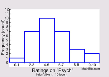
Histograms subdivide data into intervals (bins), and use rectangles (usually columns) to show the frequency (count) of observations in each interval. The choice of the size of the intervals may vary.

|
 You cannot determine if a specific value is in the data set by looking only at this histogram. The dot plot will show that the "8" is missing. The median of the data displayed in a histogram is not readily seen, as it is in a box plot.
 |

Dot Plot:
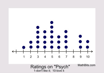
Dot plots include ALL values from the data set, with one dot for each occurrence of an observed value from the set.
 |

Dot plots work well for small sets of data, but become difficult to construct for large data sets.
A histogram or box plot will deal more efficiently with large data sets. Dot plots show all values in the set. The median, however, is not readily seen, as it is in the box plot. |

Box and Whisker Plot:
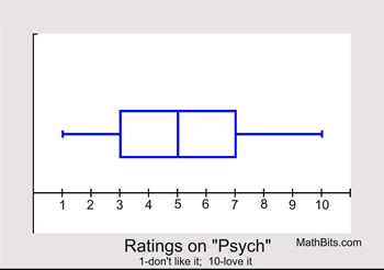
Box plots show a "five statistical summary" of the data set, dividing the data into quarters (25%). From left to right on the diagram: minimum, first quartile, median (or second quartile), third quartile, and maximum. Outliers, when present, are shown as a separate dot or asterisk.
 |

The median is readily seen in this box plot. Box plots work well for large data sets. You cannot, however, determine if a specific value is in the data set by looking only at this box plot. |

As you can see, each type of graph has its strengths and weaknesses.
Read more about these strengths and weaknesses for:
histograms, dot plots, box plots. |